

Visual content for communicating a brand: the opening question
Visual content for communicating a brand begins with a question: what does the person need to understand? A photograph can document a process, an infographic can organize a comparison and a video can show a sequence. Their value does not depend on filling a page with images, but on accompanying an idea the reader can also recognize in the text.
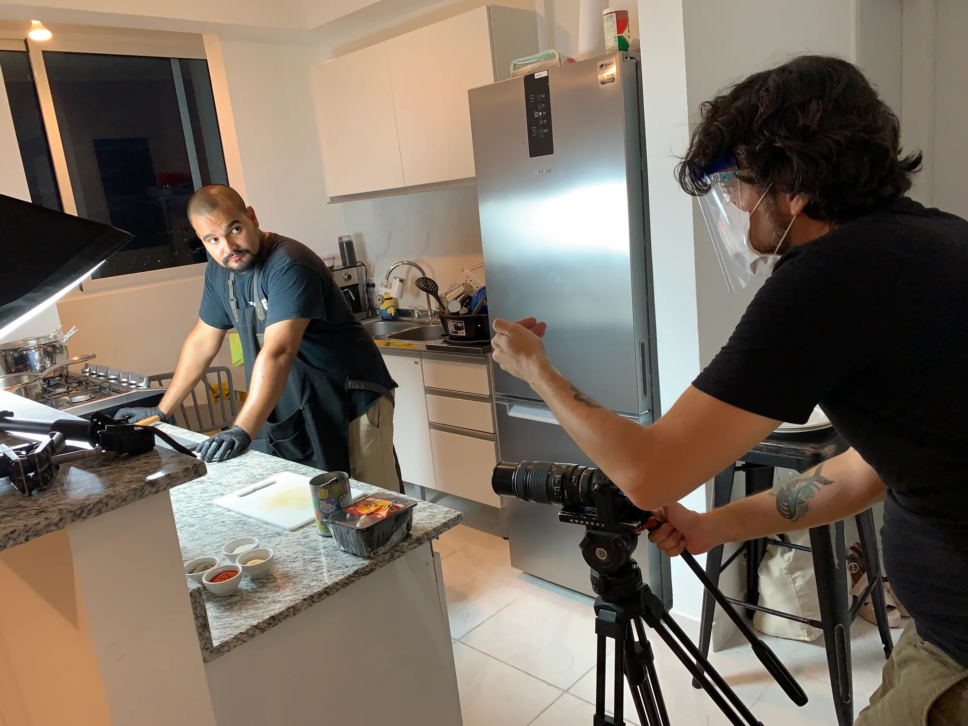
The cover of this draft uses a photograph of a shoot from Gianfranco Ferronato's archive. It shows visual production, rather than commercial results. That distinction matters: an attractive image can invite people to read, but does not confirm that the message has been understood.
When designing an experience, experiential marketing tactics offer another useful question: what will the person be able to do after seeing the piece?
Visual content for communicating a brand: the central criterion
A visual piece can present a product, explain a concept or accompany a story. To choose it, start with the idea you want to communicate. What should the person understand after seeing it? That question helps distinguish a decorative image from one that provides information.
Attention is only the beginning: content also needs a recognizable relationship with the message, brand tone and context in which it will appear.
An image should answer a specific audience question. Before choosing an attractive photograph, write down what the person needs to understand, what visual detail can help and what the text would need to explain. A short brief brings together the central idea, audience, question to resolve, expected action, channel and material's origin.
If two images seem equally striking, choose the one that answers better without a forced explanation.
A photograph of a team preparing a shoot can show part of the process. It does not demonstrate that the campaign was effective. Nor does it prove that the audience understood the message. This difference prevents asking an image to do more than it documents.
Keep the credit visible and preserve the original version, so that another crop does not silently change the fact represented.
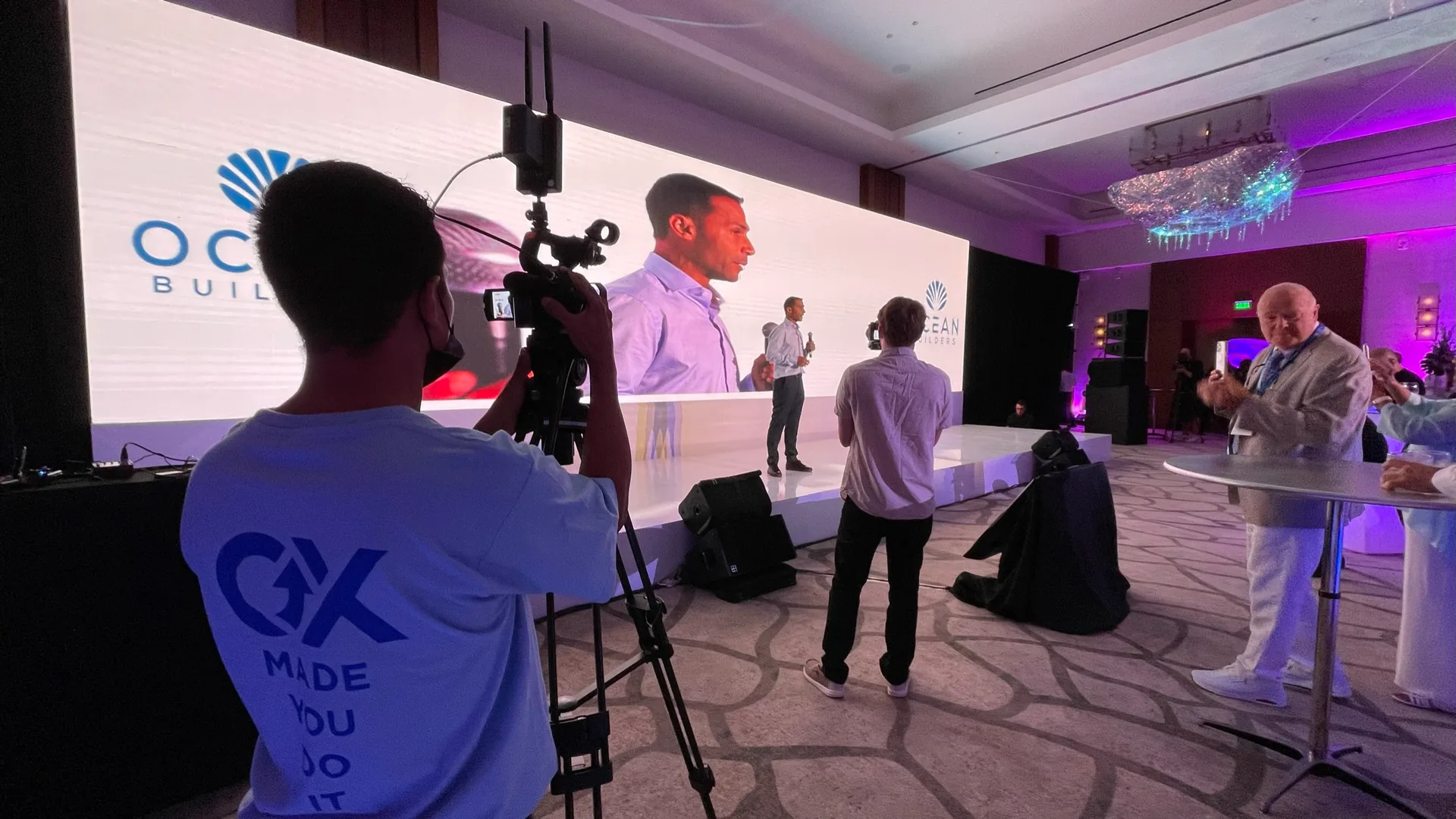
Filming an event also defines what is seen
Choose the format according to its function
A photograph can show a setting or a product detail. An infographic can organize information that needs to be read together. A video can develop a sequence or demonstrate a use. Animation offers another way of presenting an idea in motion. No format is suitable for everything.
Before producing, identify which part of the message depends on the image and which needs a written explanation. That relationship supports a considered choice, without making format variety an end in itself.
Photography, infographics and video perform different tasks. Photography lets us observe an object, place or moment; an infographic organizes relationships that are difficult to compare; a video develops a sequence whose order matters. For each format, ask what information would be incomplete if you removed it. If the answer is “none,” it may simply be taking up space.
If the sequence is essential, define what will be seen at the beginning, what will change and how the ending will be understood without sound. If you need to compare options, make sure labels remain legible on mobile and that the main explanation also exists as text. No format automatically replaces a source, instruction or conversation.
Recording authorship, context and versions makes adaptation to another channel open to review.
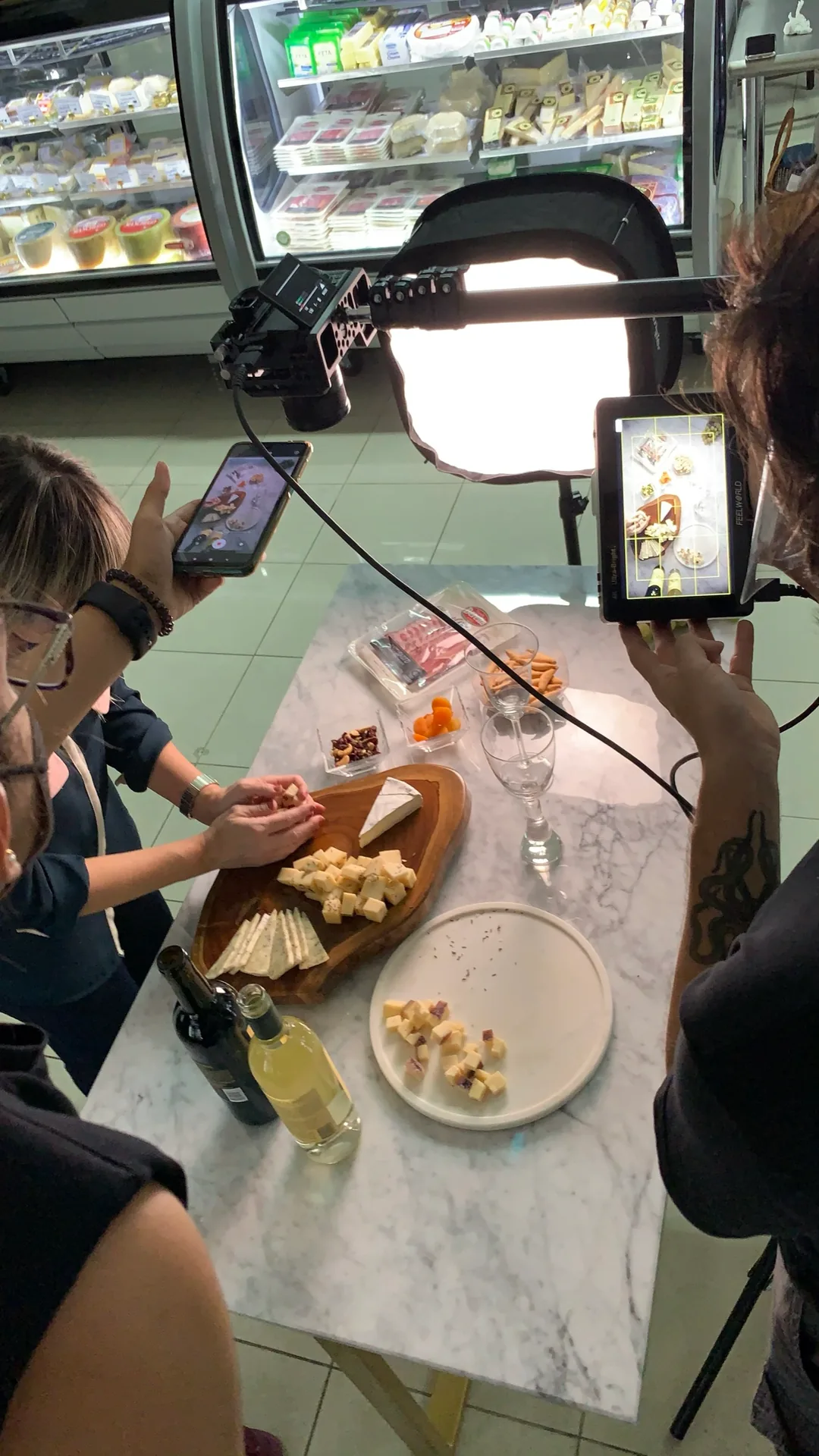
Composition of a food scene
Build a coherent visual narrative
Visual content contributes to how a brand tells its story. Colors, composition, photographs and text should support the same intention. A piece can be expressive without losing clarity, and a practical explanation can retain personality. Review whether the selected images match what the text claims.
When each element contributes part of the story, the audience encounters an offer that is easier to interpret than a collection of unrelated resources.
A clear visual narrative connects the promise, process and next step. Order the pieces as someone arriving for the first time would: what is proposed, what happens, what they can observe and where to find an additional explanation. A cover opens the question; an interior photograph can show a detail; an infographic organizes a relationship.
There is no need to repeat the same framing in all three.
Check that colors and logo match the approved brand system, without confusing a documentary photograph with a conceptual illustration. Do not use a project's photograph to represent another project without explaining that its function is illustrative either.
The guide to planning a brand event explores how to organize a complete experience; that logic helps decide what to show before, during and after an action.
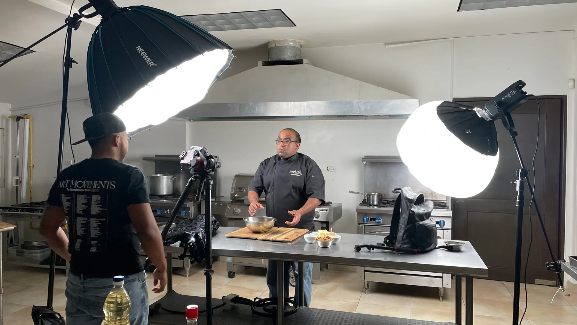
Light and framing before recording
Adapt the piece to where it will be seen
The same content may need adjustments when moving from a web page to a social post. It is useful to review framing, the amount of text and the size of important elements. A broad composition may lose meaning if the main detail falls outside the crop or if the words become illegible.
Adapting does not mean changing the central idea: it means keeping it understandable in another space. The review should include the relationship between the image, its title and the accompanying explanation.
Adapting visual content means preserving its meaning on every screen. Check horizontal and vertical framing before placing text over it: a crop can remove the very object that explains the story. Avoid relying on tiny letters inside the image; the title, explanation and important links should remain legible text.
Test the piece on a narrow screen and with a slow connection. Observe whether it loads, whether the main element is recognizable and whether the page retains context before the photograph appears. The Google Search Central image guide recommends including images through HTML elements and placing them near relevant text.
These are criteria for discovery and understanding, rather than a ranking guarantee. The guide to measuring brand experiences helps separate observed signals from attributed conclusions.
One idea, two spaces: web and social media

Also take care with image descriptions
On a website, filenames and alternative text deserve attention. They should describe the image's content or function clearly, without becoming an accumulation of keywords. Text surrounding a piece also helps situate it within the subject.
Before publishing, review whether the whole can be understood without depending on an isolated visual detail. The quality of visual content includes what it shows and how it is explained.
Alternative text communicates the image's function in its context. If a photograph provides information, describe it briefly; if a chart contains a complex process, also explain its conclusions in the body. A purely decorative image, or one that exactly repeats adjacent text, may need an empty alternative to avoid redundancy with a screen reader.
The W3C WAI ALT attribute decision tree distinguishes those cases according to purpose. Google Search Central also recommends useful, contextual ALT text, without keyword stuffing. A descriptive filename provides a clue, but does not replace ALT text, the caption or editorial review.
Before closing, ask whether someone would understand the main idea without seeing the image and why it appears in that particular place.
A review decision before publishing
The final review can be done in four passes. First, read only titles and bold text: is the idea understood? Second, look at each photograph with its caption: does it claim only what can be observed? Third, mentally disable images: does the text retain the main information? Finally, open the mobile version and check crop, size, contrast, ALT text and links.
Each pass detects a different problem.
It is useful to record one decision per version: which piece was retained, which changed and why. That traceability lets you make corrections without losing the original. If the cover attracts a visit, that is an observed event; understanding, trust or purchasing by the person requires additional evidence.
Visual content serves the brand better when it facilitates an honest conversation, rather than being credited with the entire conversion.
Credits and editorial scope
This article presents GX Live Marketing's approach to editorial work. The photographs illustrate production decisions; they are not evidence of audience understanding, commercial effectiveness or attributed results.
The photographs come from the archive contributed by Gianfranco Ferronato. The CMS preserves hashes of the supplied JPEGs and uses private derivatives without location metadata. Visible people, brands and spaces require individual review before any publication.
The Google Search Central and W3C WAI guides linked in the body support only the specific technical guidance on images and alternative text. They are not sources for this article's strategic approach or evidence of GX results.
Frequently asked questions
Does every image need the keyword in its ALT text?
No. ALT text should describe that image's information or function in context. Forcing the keyword into it can make it less useful.
When is an infographic appropriate?
When it helps compare elements or follow a process. Its important conclusions should also be available as text on the page.
Can I use the same photograph on the web and social media?
Yes, if its use is authorized and each framing preserves the meaning. Review crop, legibility, credit and context for each version.
How do I know whether an image helped explain?
Define beforehand what the person should understand or do. Observe questions, difficulties and actions; do not attribute a commercial result based on a temporal coincidence.