
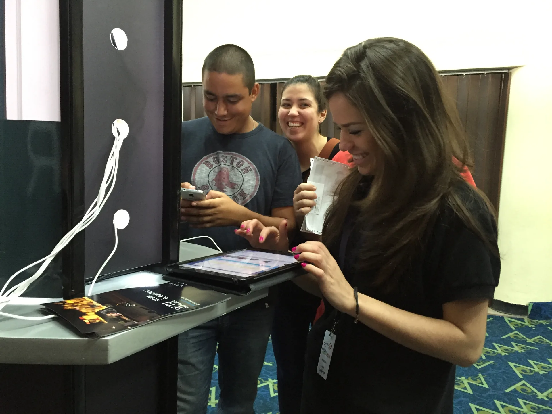

Mobile marketing: an experience, not just an ad format
Mobile marketing works with touchpoints on personal devices. It can include messages, content, services and interactions that support a relationship with the brand. It is not limited to placing advertising on a small screen. Its usefulness depends on the person's need and the context in which it appears.
The task offers a better starting point than the channel. Someone may look up an address while traveling or review conditions from home. Even when using the same phone, their attention and restrictions change. Planning for that difference is more useful than treating every mobile visit as an identical situation.
The people-centered perspective is preserved from the original text. Designing connected experiences across channels allows us to think beyond an isolated promotion. This does not imply a universal formula or a quotation attributed to an institution. It is a way of organizing work so technology supports an understandable interaction.
The audience needs context as well as general characteristics. Our guide to audiences in marketing helps formulate questions about needs and habits. Investigate how a task is carried out without assuming that age, device or location explains the entire intent. A person cannot be reduced to the data a tool records.
Recognize the moment of use before asking for attention
The same action can take place under very different conditions. Reading an information sheet in a quiet space is not like looking for access in sunlight. Consider light, movement, connection and available time. The office represents just one context.
The priority should be what allows the task to continue. If the person needs a location, show useful information before a lengthy introduction. If they want to compare services, give them enough context to decide. Cutting text without judgment can remove the very detail that made an action or condition understandable.
Interruptions have a cost for the experience. A promotional window can hide instructions, and an autoplay video can compete with reading. Assess whether each element helps at that moment. Attention should not be treated as an unlimited resource the person must give to access basic information.
A clear exit is also part of the journey. Allow people to close a promotion, return to previous information or continue later if the task permits. Do not rely on the person reconstructing the path on their own. Continuity should be visible when an interruption in their surroundings forces them to leave temporarily.
The context of use changes during the journey

Move from one channel to another without losing the promise
Continuity requires destinations to speak about the same offering. An ad, a page and a customer service conversation may serve different functions, but should not contradict essential conditions. Review names, availability and the next step. People should not have to understand your internal organization to know what is being offered to them.
The in-person experience can be supported by mobile access. In our live marketing guide we explain live interaction. A link or code can expand information, but does not replace signage, staff or service. Define what happens if someone cannot use their phone or prefers a direct explanation.
A code is a doorway that needs a useful destination. Place it where it can be read and explain what it opens before asking people to scan it. Check the route and avoid taking people to a home page that forces them to search again. The physical location of the access point and the digital content should be planned as related parts.
Consistency does not mean copying the same piece without changes. A brief message can introduce the idea and a page can develop it. The visual content helps connect both parts when it retains meaning and legibility. Adapt format and depth to the touchpoint without altering the important information the person needs.
Adaptable reading and usable controls
A small screen should not hide necessary information. The W3C explanation of reflow addresses how to reorganize content to avoid loss of information or functionality when expanding or reducing the available space, with defined exceptions. This criterion helps review reading and layout, not certify a complete experience with a screenshot.
Controls need room for a precise action. The W3C guide to minimum target size addresses dimensions, spacing and exceptions. Review nearby links and buttons, especially for important tasks. Meeting a minimum does not mean every control is comfortable under all conditions of movement or use.
A button's wording should anticipate its result. Distinguish viewing information, requesting and confirming so people know what will happen. Avoid instructions that depend only on color or position. An adaptable design preserves both access to the control and the meaning of the decision that control allows people to make.
The test should cover the complete task on the device. Check data entry, error messages and confirmation as well as initial reading. Review what happens when text is enlarged and the keyboard opens. A home page that adjusts well does not demonstrate that all subsequent steps are usable.
Permissions and communication that respect a choice
Access to a feature does not authorize every subsequent use. A person consulting information is not necessarily expressing interest in receiving promotions. Explain what is being requested and why. Applicable details should be reviewed according to the service and context, without turning a technical decision into general commercial permission.
The relevance of a message should be understandable to its recipient. A notice about an active task has a different context from a promotion. Define frequency, the responsible person and ways to manage preferences. If you cannot explain why that communication is relevant, review the need to send it at that moment.
Location requires a reason related to the task. Do not assume every mobile experience needs to know where the person is. In some cases, letting them choose an area or type an address is enough. Avoid collecting additional information merely to increase the detail available in an internal report.
The person should be able to continue through an appropriate route. If an interaction depends on a capability they do not have, offer information about available alternatives. Also review how they request help or change a preference. Designing visible exceptions is more honest than presenting mobile as the only possible access to any service.
Prepare a bounded experience and evaluate it with judgment
The pilot should represent a real and clearly defined need. Choose a task, an entry point and a destination you can support. Describe what completing it means and which failures you need to observe. An attractive demonstration helps discuss the design, but does not substantiate that the complete service is already ready.
Observation should separate access, interaction and resolution. A scan indicates a step; it does not demonstrate reading, understanding or purchase. Our guide to measuring brand experiences helps formulate questions according to the objective. Do not use a single participation figure to explain every part of the journey.
Context can explain differences between journeys. Review whether a drop coincides with loading problems, location changes or confusing instructions. Record observed conditions before attributing a cause. A correlation in the report does not demonstrate that the device or the piece alone is responsible.
Learning should produce an improvement you can sustain. Adjust the priority difficulty and check the journey again. Avoid adding channels if service is still missing in the current one. Mobile marketing brings clarity when it connects a need with an answer, not when it multiplies contacts without service behind them.
Mobile marketing: visual guide

Documentation and editorial judgment
W3C · WCAG 2.2, explanation of reflow. Reorganizing content without loss when space or zoom changes, with exceptions; design support, not a definition of mobile marketing.
W3C · WCAG 2.2, minimum target size. Dimensions, spacing and exceptions for controls; it does not constitute project certification.
Frequently asked questions
Does mobile marketing mean having an app?
No. It can include an adaptable page, messages or access to information from a phone, depending on the task. An app is one possibility that needs its own justification. Start with the problem and the journey, not the assumption that everyone must install a product.
How does a mobile experience differ from desktop?
Space, data entry, connection and the context of attention may change. Important information should be preserved even if its presentation is adapted. Check reading, controls and confirmations in the real task rather than limiting the review to an image of the home page.
What should a code used in an activation open?
A destination that fulfills the visible promise beside the code: information, instructions or a specific task. Explain what it opens, check the route and avoid unnecessary steps. Also plan how to assist someone who cannot scan it or does not want to use their phone at that moment.
How many scans indicate that the experience was a success?
There is no universal number. First define the task and what you need to understand. Scans show an access step; add observations about continuity, understanding and resolution when you can verify them. An experience can receive many visits and still leave unanswered the need it intended to address.
From this idea to your next project
Tell us what you want to achieve. The guide will help organize your inquiry; you can review and correct it before anything is sent.
Prepare your project with GX